25 Best Tattoo Websites Tattoo Artists Should Know About
There are 21,000+ tattoo parlors in the U.S., and the tattoo industry is expected to grow around 8% every year over the next ten years.
To stay above the competition and get your piece of this
$1.6 billion industry, you need a website that’s as visually stunning as your art.
In no particular order, here are some of the best tattoo websites around, and why we like them:
1. Golden Rule Tattoo
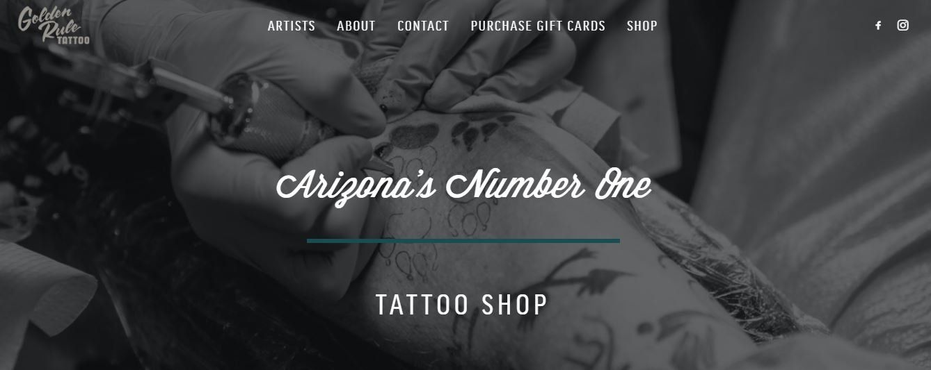
Golden Rule Tattoo’s website emphasizes simplicity and clout. Golden Rule has the advantage of being voted “Best Tattoo Shop” and is home to the winners of the “Best Tattoo Artist in AZ” for 7 years in a row, which is important for visitors to know. Their color scheme is black and white with teal boxes and lines, and they make good use of white space. Lastly, the site is clean and easy to navigate.
2. Revolt Tattoos
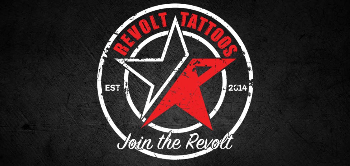
Revolt Tattoos is black, white, and red all over. The carousel images capture your attention and invite you to “Join the Revolt.”
The web copy below the fold states they want to embrace “your inner rebel while taking a stance against social constructs.” To accomplish their mission, their staff includes some of the best tattoo artists around. Their
Artists
page also does a great job of showing which of their tattoo artists work where, making it easier for readers to decide who to work with.
3. Minneapolis Tattoo Shop
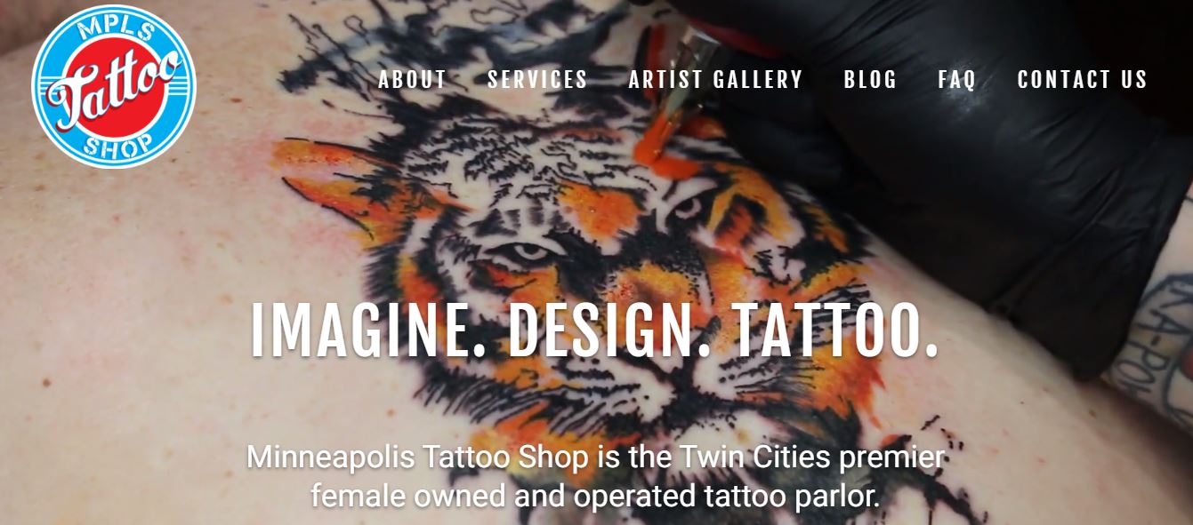
Minneapolis Tattoo Shop has a white background, a stark contrast to many of their competitors. The hero images on their pages are vibrant, beautiful examples of their work. Their artist galleries take to you each tattoo artist’s Instagram page where you can enjoy their portfolio of work.
Minneapolis Tattoo Shop is female-owned and speaks directly to their visitors. The copy on their homepage reads, “We understand that getting a tattoo is a big decision, and our amazing artists will use their years of professional experience to ensure you get the best tattoo, and a treasure memory of a great experience.”
4. Bearcat Tattoo
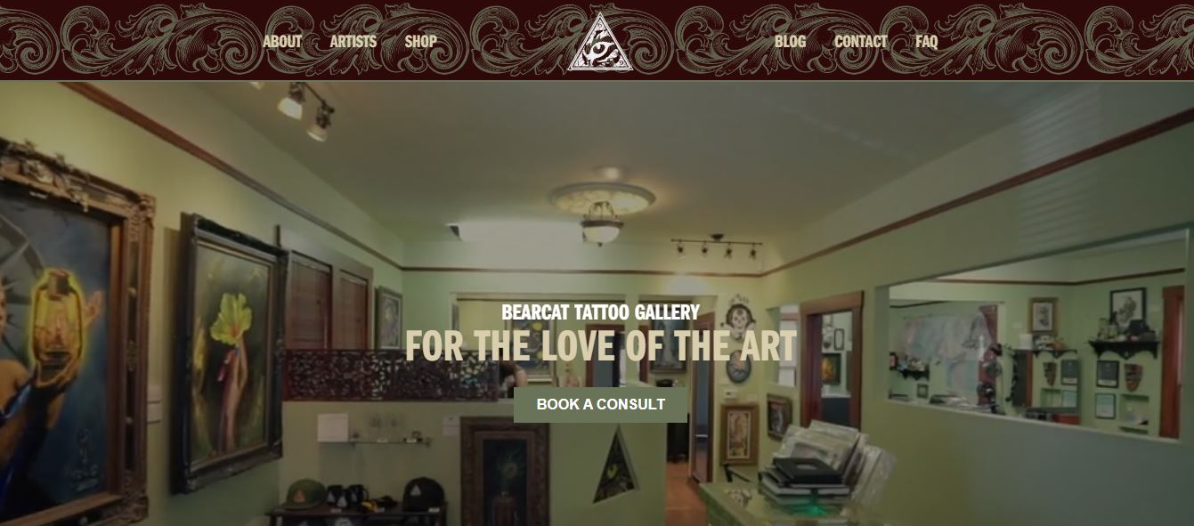
The best tattoo websites can make you feel something before you go under the needle. For Bearcat Tattoo, that feeling is warmth.
Bearcat Tattoo’s hero video invites you into their shop to showcase their tattoo designs. The copy below pairs nicely, stating “we’re like family here, and you’re always welcome.” Bearcat Tattoo is home to tattoo lovers. Each of their artists brings with them their “heart, passion, travels, style, personality, and influences.”
5. Chapter One Tattoo
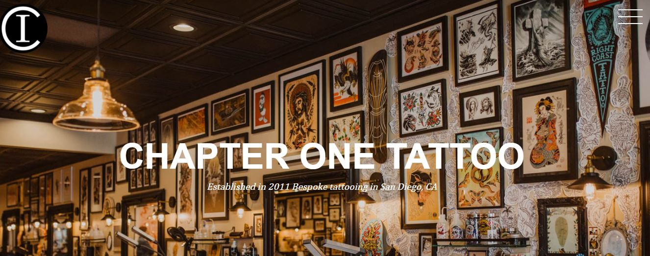
Chapter One Tattoo focuses on their tattoo artists. Once they explain “The Deal” to you, you’re invited to scroll through their staff of talented tattoo designers, each of whom has a short bio, so readers can familiarize themselves with their aesthetics and tattoo art.
The rest of Chapter One Tattoo’s landing page is clean, simple, and responsive.
6. Goodkind Tattoo
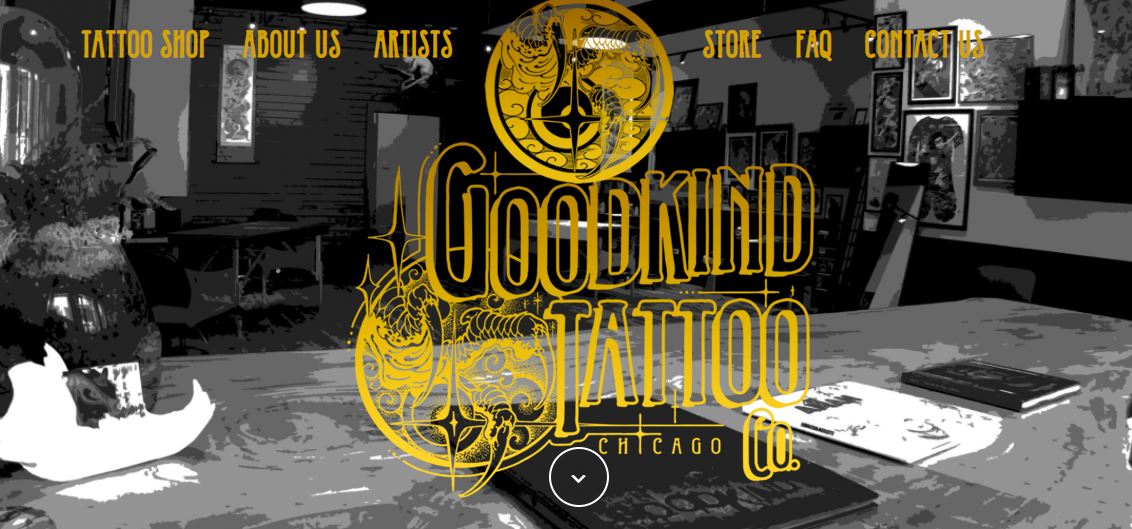
Goodkind Tattoo’s web design is a classic black, white, and gold. The copy is bulkier than most other tattoo websites, but it does a good job explaining who they are and why they exist.
Each of their tattoo artists has a black and white image, with portfolios showcasing their own tattoo art, and their tattoo photos are an explosion of color that contrasts with the rest of the site.
7. Body Electric
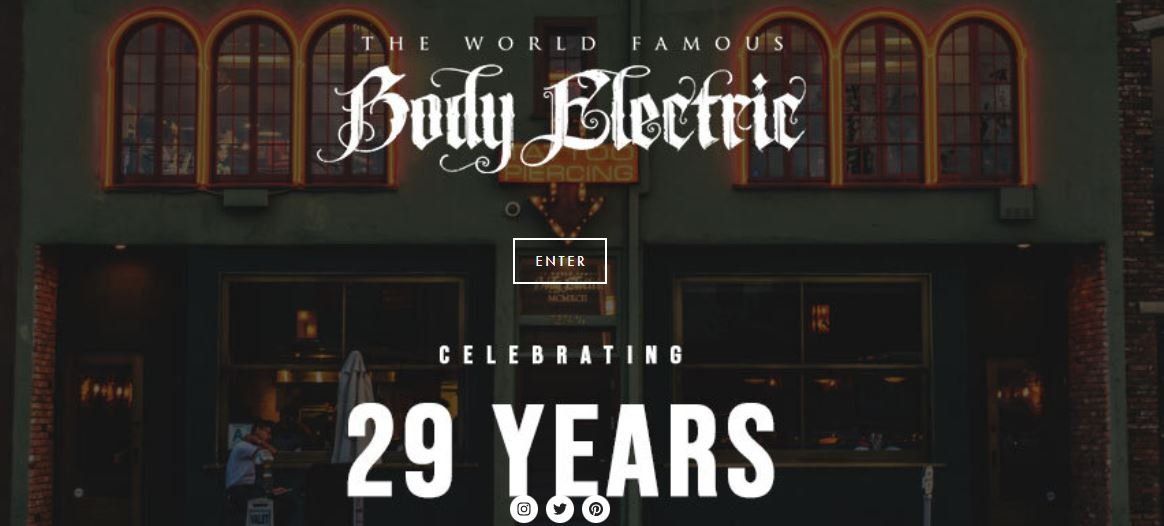
Before you can enter the site,
Body Electric tells you they are “world famous” and in business for “29 years” (at least as of this post). Their homepage is heavy on images and calls-to-action. Body Electric shows you their work through large landscape pictures, with minimal copy only where it’s needed. Our only criticism is that it takes two clicks to find anything you need.
8. Ever True Tattoo
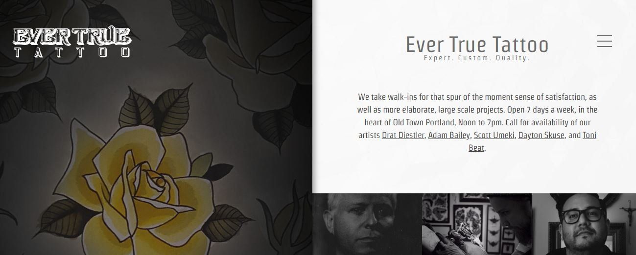
Ever True Tattoo makes full use of its space above the fold. The left half of the home page has sliding images of tattoo designs, while the tattoo designers appear on the lower right. If you scroll over their images, you’ll get the name of the tattoo designer and can click to learn more about them. When visiting the site on a laptop, you don’t have to scroll anywhere to get the information you need.
9. Tattoodo
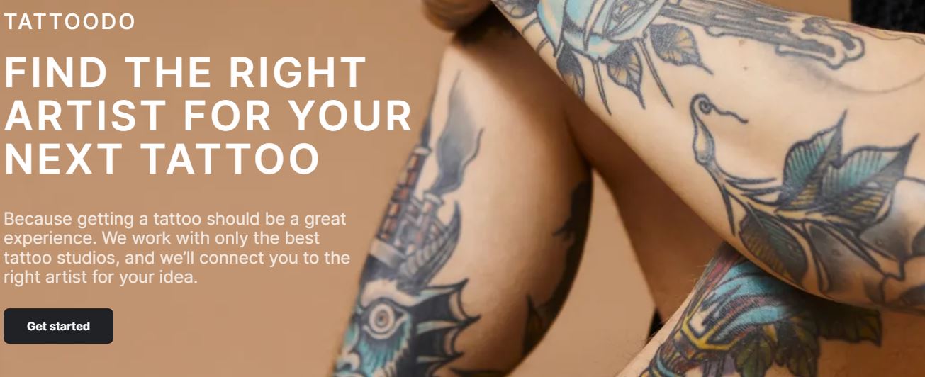
Tattoodo invites you to “find the right artist for your next tattoo.” Tattoodo has some images of tattoo designs and ideas. The website focuses more on what a potential customer can expect from there. Their “how it works” is short and sweet, and their carousel of testimonials highlights some of their nearly 200 reviews. Also, their tattoo
section does a great job showcasing their body art versatility.
10. Trader Bob’s Tattoo
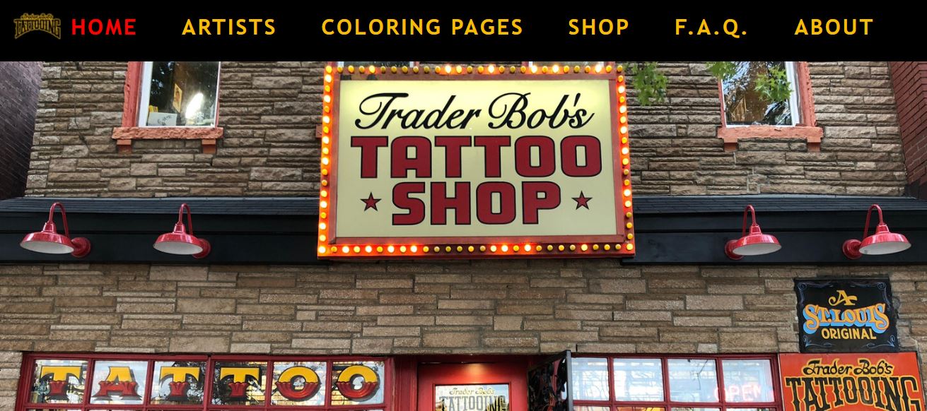
Trader Bob’s Tattoo uses their colorful storefront and their hero image. Below are images of several of their custom tattoo designs and where to find them. Their navigation bar is user-friendly, and each of the tattoo artist’s links go straight to their portfolios, which are inked in stunning tattoo images.
Excluding their FAQ page, the content is a little light, and their “About” page is mostly just a map of St. Louis. However, their art speaks enough for itself.
11. Sacred Tattoo
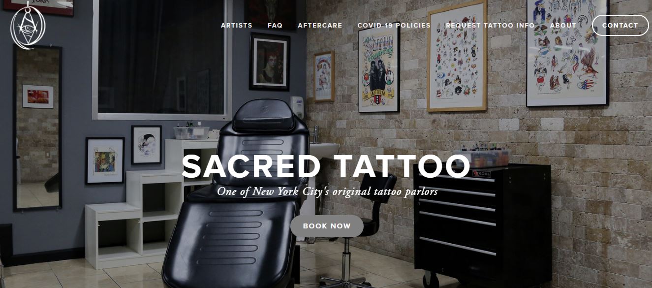
Sacred Tattoo’s hero image is of the chair where you’ll get ink. They also state they are “one of New York City’s original tattoo parlors.”
Sacred Tattoo took a unique approach when featuring their tattoo artists. Instead of using mugshots, they use one of their best tattoo designs, placing the focus on the art, not the people. These images of creative and unique tattoos quickly give the reader an idea of which artist they’d like to get a tattoo design from, without having to do too much digging.
12. Ink and Iron
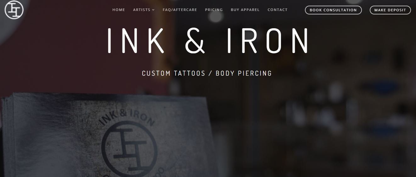
Ink and Iron sports a classic black and white site. The only color that appears is in the tattoo art itself. While blobs of text run a little long, the tattoo website makes great use of white space. Like Sacred Tattoo, the tattoo designs are in place of the artists’ mugshots, putting their work front and center. The Michael Biondi quote just below the page fold provides a nice touch. “Our bodies were printed as blank pages to be filled with the ink of our hearts.”
13. Dinkytown Tattoo
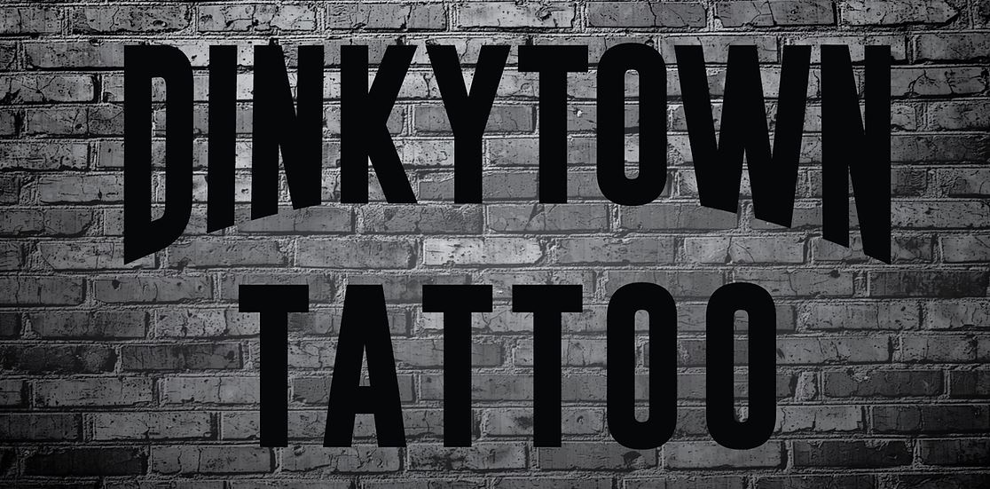
Dinkytown Tattoo’s website is about as minimalist as websites come. The hero image is just the words “Dinkytown Tattoo” etched in black with white and black brick behind them. Beyond that, you get the address, hours of operations, a contact form, and information about their tattoo and piercing services, and the names of the artists and a few of their best tattoo ideas.
14. Electric Anvil Tattoo
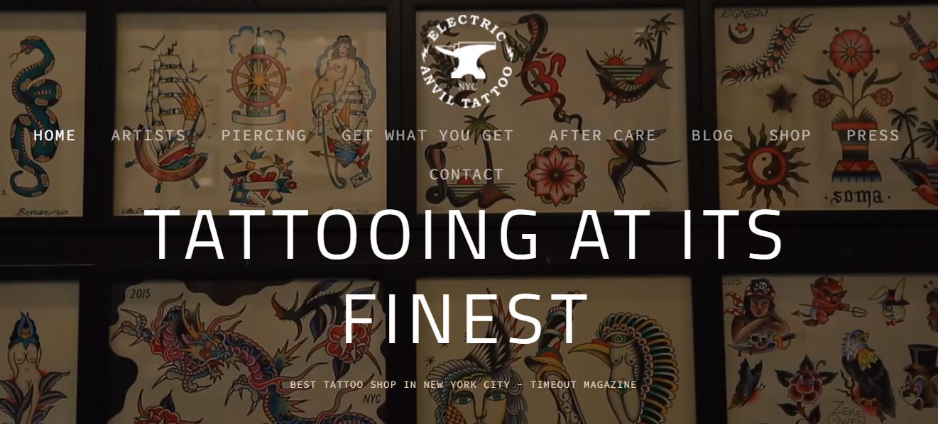
Electric Anvil Tattoo’s home page has a collection of beautiful moving images showcasing their tattoo work. The words “Tattooing at its finest” appear front and center, and in white bold letters. Each of the artists has their own individual pages with a short bio, paired with their massive portfolios. Overall, their site is simple, professional, and easy to navigate.
When you first visit their site, a pop-up box appears and asks if you’d like to schedule an appointment.
15. Seattle Tattoo Emporium

Seattle Tattoo Emporium is America's oldest tattoo parlor, which they mention several times on their home page. After scrolling down a little, you’re invited to meet their artists, learn about their history, or contact the tattoo parlor. They also have a tattoo art and equipment museum you can visit.
Their use of gray, red, and tan is a nice change from the black and white designs of many other best tattoo websites on this list.
16. Dark Horse Tattoo
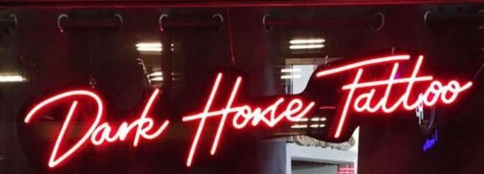
Dark Horse Tattoo immediately draws you in with their beautiful, almost hypnotizing hero image. Scroll a little further, and you can see their awards and a few sentences about their artists and the customer experience. Their FAQ section is extensive and informative, and the images of their custom tattoo designs practically jump off the screen.
As far as visuals go, it’s no wonder why Dark Horse Tattoo is one of the most visited tattoo websites in the Seattle area.
17. Nokomis Tattoo
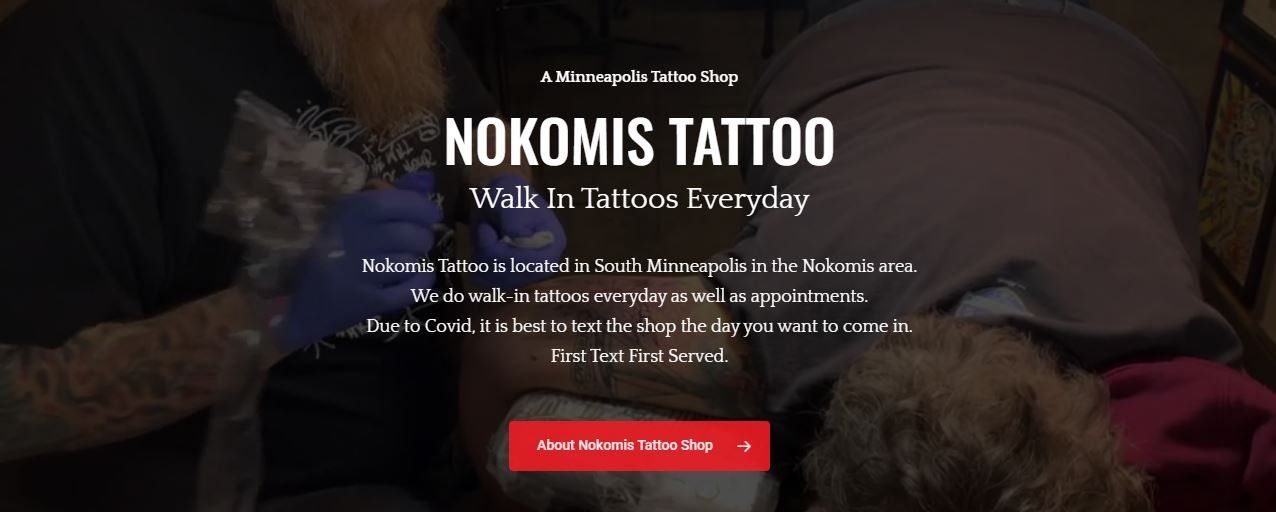
Nokomis Tattoo is another website that plays with black, white, and red. It’s a really easy site to navigate, and they immediately state they specialize in walk-in tattoos. If other tattoo shops in the area are only by appointment, this may be a great opportunity for them.
18. Leviticus Tattoo and Piercing
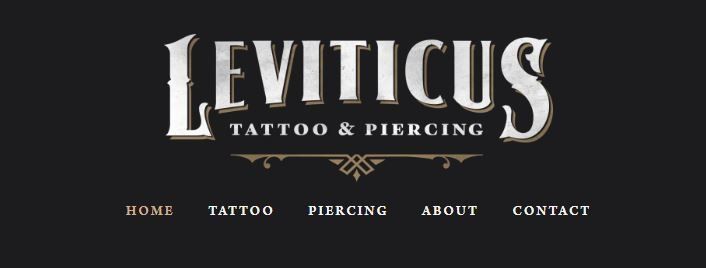
Leviticus Tattoo’s website is primarily black with some white, gray, and gold text. Their tattoo artists are also represented by their works, not the mugshots. In their about section, they state they value respect and kindness and take pride in their shop. All the images are striking and high-quality, and the pictures of their shop do an excellent job of intriguing their site visitors, making them want to see the shop in person.
19. True Blue Tattoo
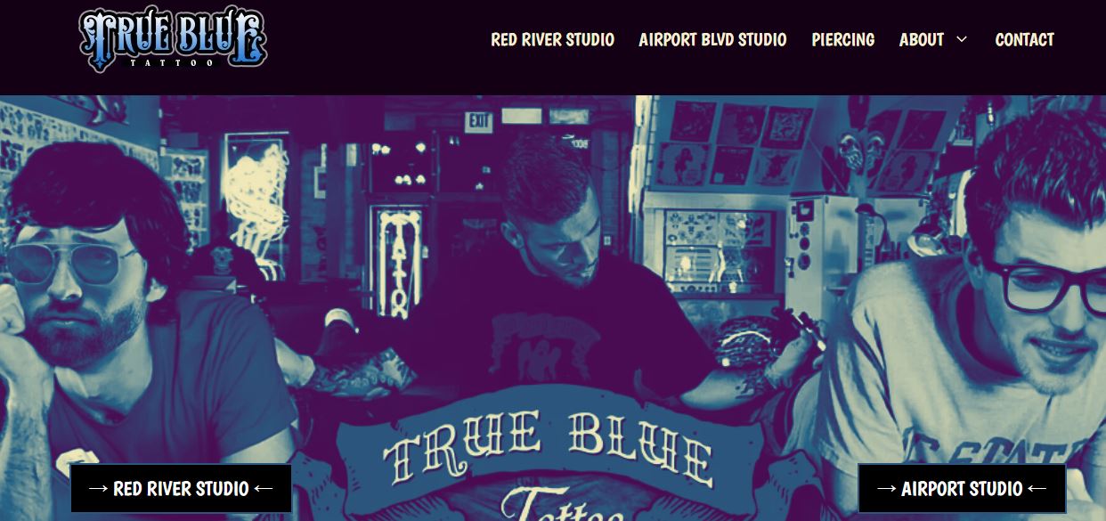
True Blue Tattoo’s hero image injects a little humor, and does a great job of helping visitors determine which of their two studios to visit. Also, the shades of blue used throughout the site are fun and unique. Their one paragraph description on the homepage does a great job of telling you about their vast experience. It’s also easy to determine which artists work where, and what they do.
20. Platinum Ink

Platinum Ink has been “poking people pretty since 2002.” The design is darker, with neon “tattoo” signs portraying their storefront. Their web copy is concise, but does well to establish Platinum Ink as a high-quality tattoo parlor that’s been around for awhile. As with almost every other tattoo website on this list, the site is clean and easy to navigate.
21. Wonderland
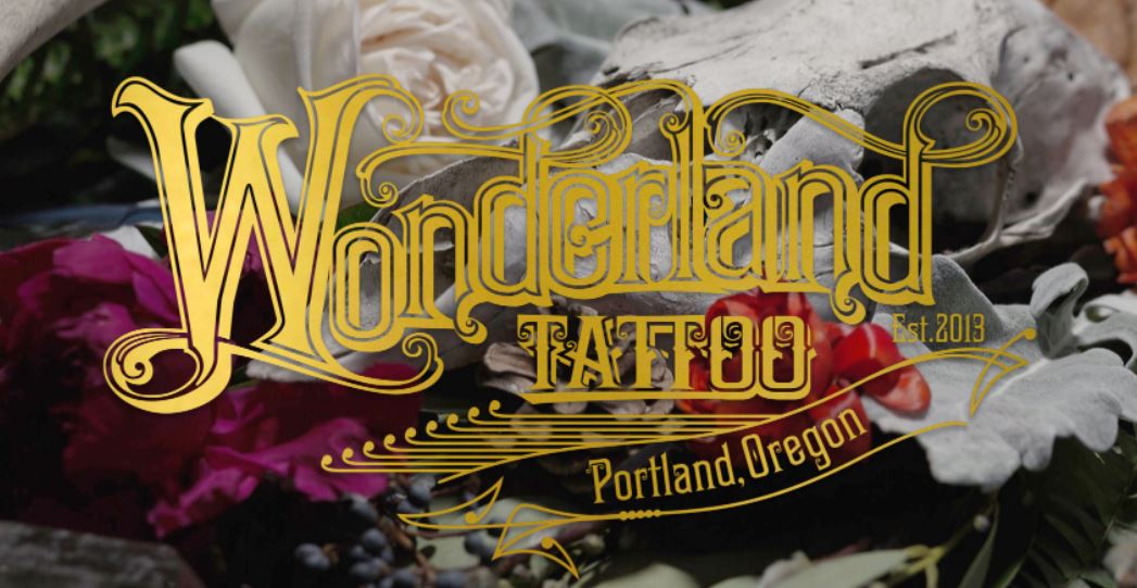
Wonderland marries whimsy and quality. Their tattoo website features a beautiful flowery hero image, and then tells readers they “create custom tattoos, and magic.” Their other photos align well with the featured image, which adds a nice touch. Each of their tattoo artists has their own bio and portfolio, where you can find more images that resonate with Wonderland's theme.
22. Bellwether Tattoo
Bellwether Tattoo only features one artist, Suzanna Fisher, but nearly the entire homepage is a collage of her impressive tattoo art. Suzanna “specializes in custom tattoo, photorealistic tattoos, portraits, black and grey tattoos, and imagery that is organic and that flows well with the body.”
Between this description and her extensive portfolio, site visitors will know immediately if Bellwether Tattoo is the place for them.
23. Slave to the Needle

Slave to the Needle incorporates light pink hues in their design. Readers will discover that the Slave to the Needle is a group of “friendly, talented, highly motivated people” who can discuss your tattoo patterns and custom tattoo design ideas. They then highlight their body jewelry experience and their accolades.
The web design also makes it easy to find both of Slave to the Needle’s locations, and they feature just enough tattoo designs that you’ll want to either load more or follow them on Instagram.
24. Golden Iron Tattoo Studio
Golden Iron Tattoo Studio lets you know that there’s a recipe to their success: because “a single tattoo from Golden Iron stems from hundreds of awards from tattoo conventions across the globe, which is the result from the thousands of tattoos applied every year, all driven forward by the hundreds of thousands of hours of drawing, practicing, and tattoo.” It’s a brag, but it’s an effective brag. They list their impressive statistics below the fold.
Also, their
featured artists page contains a collection of dramatic, but fun images of the artists.
That said, this website has a few flaws. The hero image invites you to view their work, but then takes you straight to their Instagram page, as opposed to their artist or portfolio page, and their navigation bar and about page are a little busy.
25. Aardvark Tattoo Company
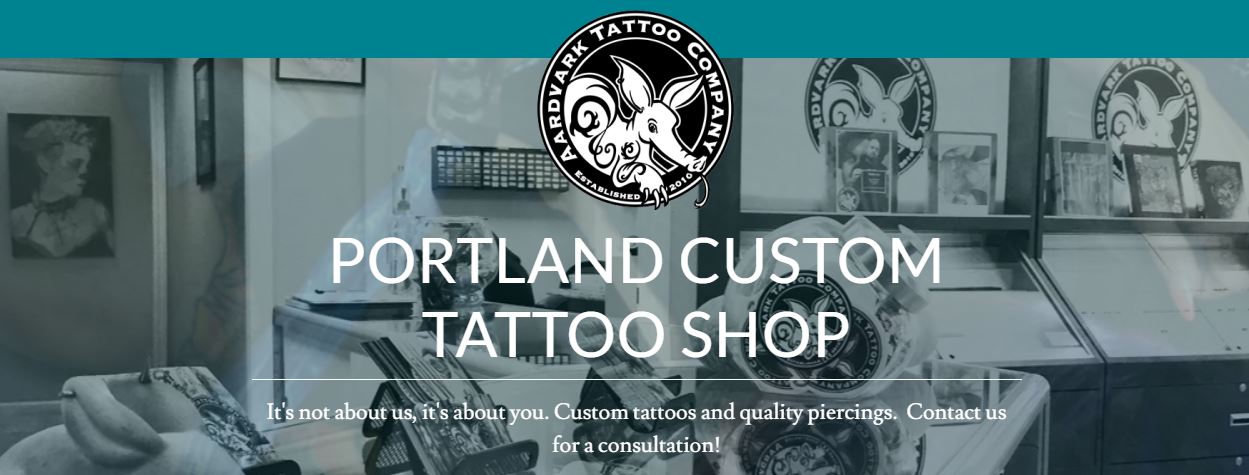
Aardvark Tattoo Company features a carousel of hero images and the words “It’s not about us, it’s about you.” They are an “all custom tattoo shop.” Every piece they do is drawn up and one of a kind for their clients, which will definitely help them stand out.
Right below are the words “diversity is beautiful,” which are written in rainbow colors with tattoo art as its backdrop. Aardvark Tattoo Company says they are welcoming people of color (POC), the LGBTQ+ community, and body art lovers. Directly stating their inclusivity is a great draw for people who don’t identify as straight, white, and cis.
Final Thoughts on the Best Tattoo Websites
The design for your tattoo website doesn’t have to be complex, and consists of endless pages of information and text. Some of the most well-designed websites on this list are simple and straightforward.
The best tattoo websites contain a few key elements:
On-brand design- User-friendly navigation
- Concise copy that speaks directly to the readers
- Visually stunning portfolios
- Clear, compelling calls to action
You deserve a website that’s as high-quality as your art. If you’re looking to drive organic traffic through your parlor’s doors, send us a message. We’re here to help you attract new clients, sell your art and merch online, and grow your business.
Contact us today.
Disclaimer: This publication and the information included in it are not intended to serve as a substitute for consultation with business consultants and professionals. Specific business, financial, legal issues, concerns and conditions always require the advice of appropriate professionals. Any opinions expressed are solely those of the participant and do not represent the views or opinions of this company.

